


UK cover
Isn't she a beauty? I absolutely fell in love with this cover when I saw it. It looks so serene and peaceful and I just adore it. It just grabbed me. I was so intrigued to find out what it was about.
I Like:
- The font. It is so pretty. It reminds me of the trails planes leave behind in the sky. It also gives me a feel that it is going to be personal because it looks like it might be handwriting.
- The tagline, "I'm supposed to be grieving, not falling in love..." Completely grabbed me. Grief is always difficult to write about and this is an interesting take on it.
- The background and colour. It is so calming and relaxing.
I dislike:
- Nothing
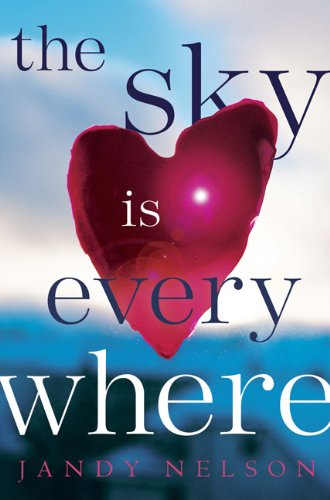
US Cover
Meh. Not my cup of tea really. Too abstract. When picking apart all the elements I dislike most of them, but I think as a whole they kind of work.
I Like:
- the fact that the heart is claiming all the attention. The book is about and love. It seems fitting.
I dislike:
- The font. Seems very sterilised and unemotional.
- The placement of the text. I don't like how the heart is overlapping it and has text over it.
Which do you like best?
I really like both the covers, but I think I like the UK one better. Have yoy seen the new UK paperback cover? It's gorgeous. :D
ReplyDeleteI have seen it. It is very pretty. I'll check it out in a bookshop when it is out to see if I want it but I love the format and the little strap on my UK cover now :)
ReplyDeleteThe new cover is definitely my favourite too :) Nice post!
ReplyDeleteMostly Reading YA
Thanks :) it really is a great cover!
ReplyDeleteI like the UK cover better. The US cover looks like a crappy adult novel haha :)
ReplyDeletehaha :) It doesn't look very YA at all, does it?
ReplyDeleteNice breakdown of the two covers! I don't really love either. Neither one makes me want to read the book, though I do like the colors of both. I'm glad you featured your UK copy in one of the IMM videos. I really like how they make it look like a journal with the strap.
ReplyDeleteThank you :) The colours are lovely. Very calming. The layout definitely sells the UK book as well, I find. I love how it is done.
ReplyDeleteI've never seen the UK cover but I like it a lot more! It's just so cute and fresh and adorable.
ReplyDeleteIt is very fresh looking. I really love that about it!
ReplyDeleteGreat writing. I especially like the way you deconstructed this book. It is very helpful to read your insights so I can decide whether I want to read this book. I look forward to having you analyse more books this way.
ReplyDelete