


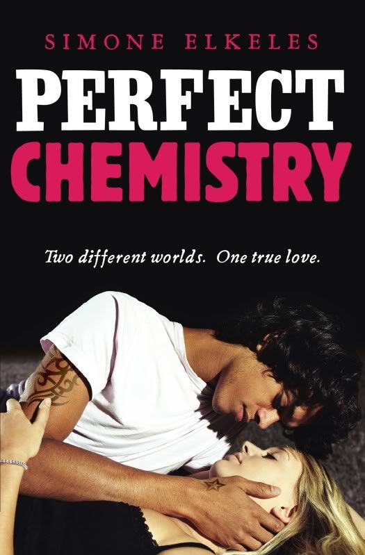
US
It is an okay cover. Not great. Not bad. Just okay. It seems very cheesy and I think, whilst being an accurate portrayal of the book, it makes it seem a lot more cheesy than it is.
I like:
- The font. I like how it looks slightly burred. I don't know why, I just do.
- The sole focus on the couple. The absence of anything around them mirrors their relationship in the book.
I don't like:
- The absence of a tagline. I love tag lines.
- how cheesy it is. The book is about so much more than them being romantically involved
★★★
3 stars
These are quite similar. I though it was only the title that was different (and the tagline) but the tattoo is also different and bigger. I wonder why. I think they are equal in terms of how much I like them.
I like:
- The placement of the tagline
- The size of the font.
I don't like:
- The cheesiness of the tagline. Not good.
- the font.
LOL. I totally agree. It's the cover on this book that has totally put me off reading it you know :)
ReplyDeleteDefinitely! The only reason I read it was because everyone was raving about it!
ReplyDeleteI am unsure about the covers, it's very different from what you see now with most covers.
ReplyDeleteSimple, l would say the picture hasn't been edited a lot either!
You can definitely tell it is a slightly older book. I agree. Not very edited at all. I don't know if that is a bad thing though...hmm
ReplyDeleteI think I like the first cover better, but at first glance it doesn't really grab my attention or anything. But I've heard great stuff too, so I'd like to read it!
ReplyDeleteIt is definitely worth reading! I think I slightly prefer the first cover, but only slightly.
ReplyDeleteI prefer the first cover to the second, but both are not my style. I don't like photographic covers. I need something more to suck me in. The first cover's title font is cool because it gives a feeling of movement. I hate the title font in the second one, c'mon pink? really? lol - yuck!
ReplyDeleteI like the original cover (the top one). I like the simplicity of it. I also like the blurred title. This book has received LOTS of rave reviews and is a well liked book!
ReplyDeleteHere is our cover crazy: http://evesfangarden.com/blog/2011/02/07/cover-crazy-2/
Gina: I know, the pink makes it seem even more cheesy. Red would have been more appropriate, if anything. I agree, the first one is slightly better.
ReplyDeleteJaevenstar: The blurred title is a redeeming quality for me. It is SO amazing, the book. Defintieyl worth a read!
I agree the covers are just okay but if I were buyng books based just on the cover this wouldnt be one of my picks. But I have heard good things about the book so it is on my TBR list.
ReplyDeleteHere are my covers
http://paranormallyromanced.blogspot.com/2011/02/cover-crazy-monday-2.html
I love the second cover so much better! Nice post this week!!
ReplyDeleteMelissa: I agree. I am so fortunate book bloggers practically forced me to read it. If I was in charge I wouldn't have. READ IT. It is amazing!
ReplyDeleteTawni Ann: Thanks :)
I prefer the US cover. I like the blurred effect with the font. The big pink font on the UK cover is distracting and makes it look like a fluffier book. The US font makes it look a little edgier.
ReplyDeleteI like how you use this feature to compare two covers.
Definitely! The pink makes it that much cheesier. I think if it were in a different colour I wouldn't mind it so much.
ReplyDeleteThanks :)