


US
It is an okay cover. Not great. Not bad. Just okay. It seems very cheesy and I think, whilst being an accurate portrayal of the book, it makes it seem a lot more cheesy than it is.
I like:
- The font. I like how it looks slightly burred. I don't know why, I just do.
- The sole focus on the couple. The absence of anything around them mirrors their relationship in the book.
I don't like:
- The absence of a tagline. I love tag lines.
- how cheesy it is. The book is about so much more than them being romantically involved
★★★
3 stars
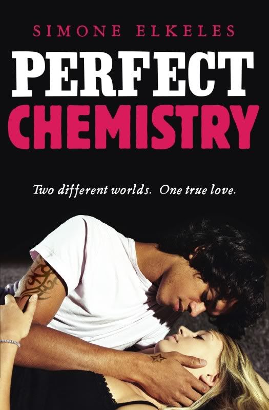
These are quite similar. I though it was only the title that was different (and the tagline) but the tattoo is also different and bigger. I wonder why. I think they are equal in terms of how much I like them.
I like:
- The placement of the tagline
- The size of the font.
I don't like:
- The cheesiness of the tagline. Not good.
- the font.

